

BRANDING
Client case study
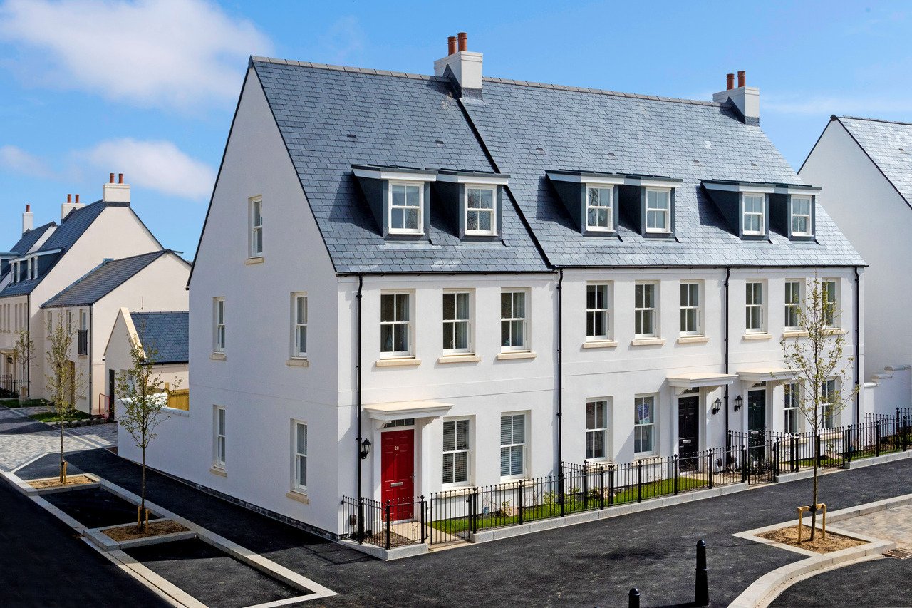
Building Futures
One of my first big branding projects was for a new market town being built in the South West. The development only had a name and we had to come up with a branding that would withstand the test of time, while encapsulating all that a town represents.
We came up with a strong, timeless, yet playful design. The focus on symbols allowed us to represent the areas and aspects of the town, also giving it the ability to be dynamic. The considered font choice honoured the market town aesthetic and the complimentary colours allowed for diversity in how the brand was applied to online and offline platforms.


Whether you're launching a new product, revamping your brand,
or just need some help with a one-off project, I'm here to help.