

PACKAGING
Client case study
Before
Previously my clients mailer box lacked the personality and vibrancy the brand wanted to promote. There was a need to design a packaging box that instantly communicated the brands energy and celebrated their non-alcoholic spirits in style.

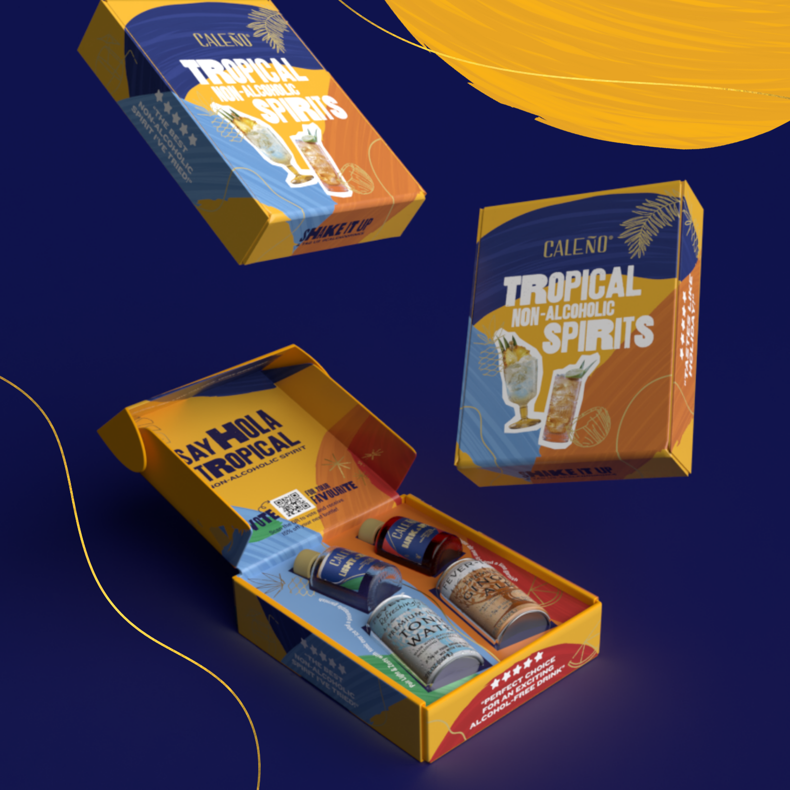
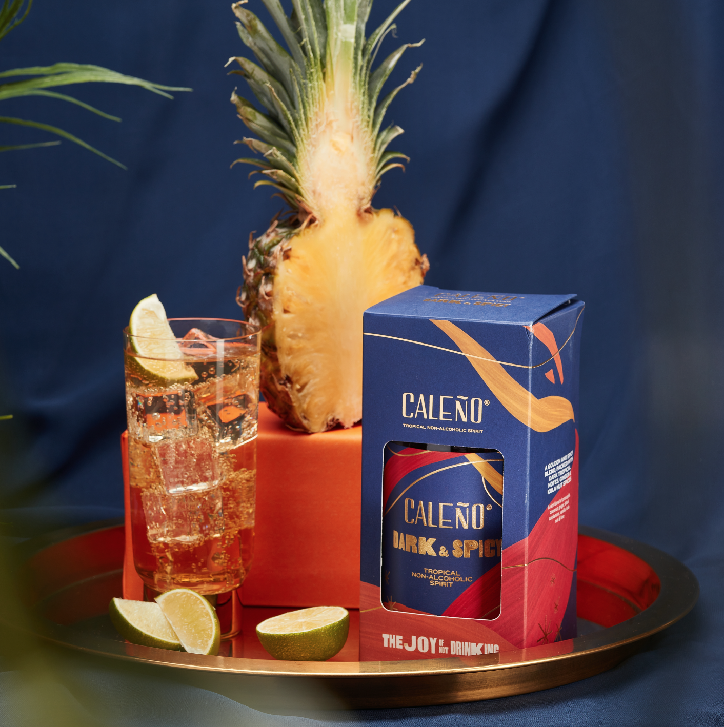
Client case study
After
We designed a colourful mailer box full of fun and vibrancy. Focusing on movement and energy, I designed the box to have a wrap around design that spilled into the internal layout.
This design was selected to be featured in The Best Plant and Vegan Product Packaging Designs for 2024 by DesignRush, a platform known for promoting the best designs

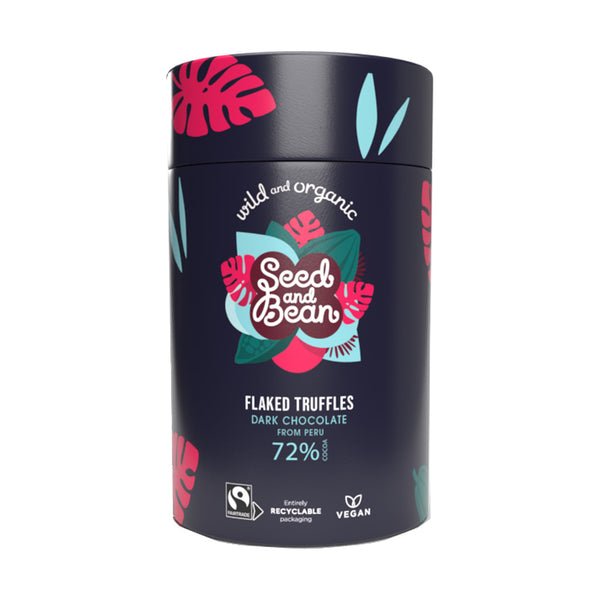
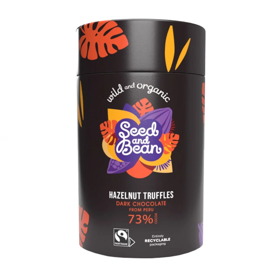
Client case study
Before
My client already started off with beautifully colourful branding, and this was a unique attribute of their branding that they wanted to take forward. They wanted a minimal and sensitive re-brand of their wrappers to draw more attention to the flavours and unite the collection together.

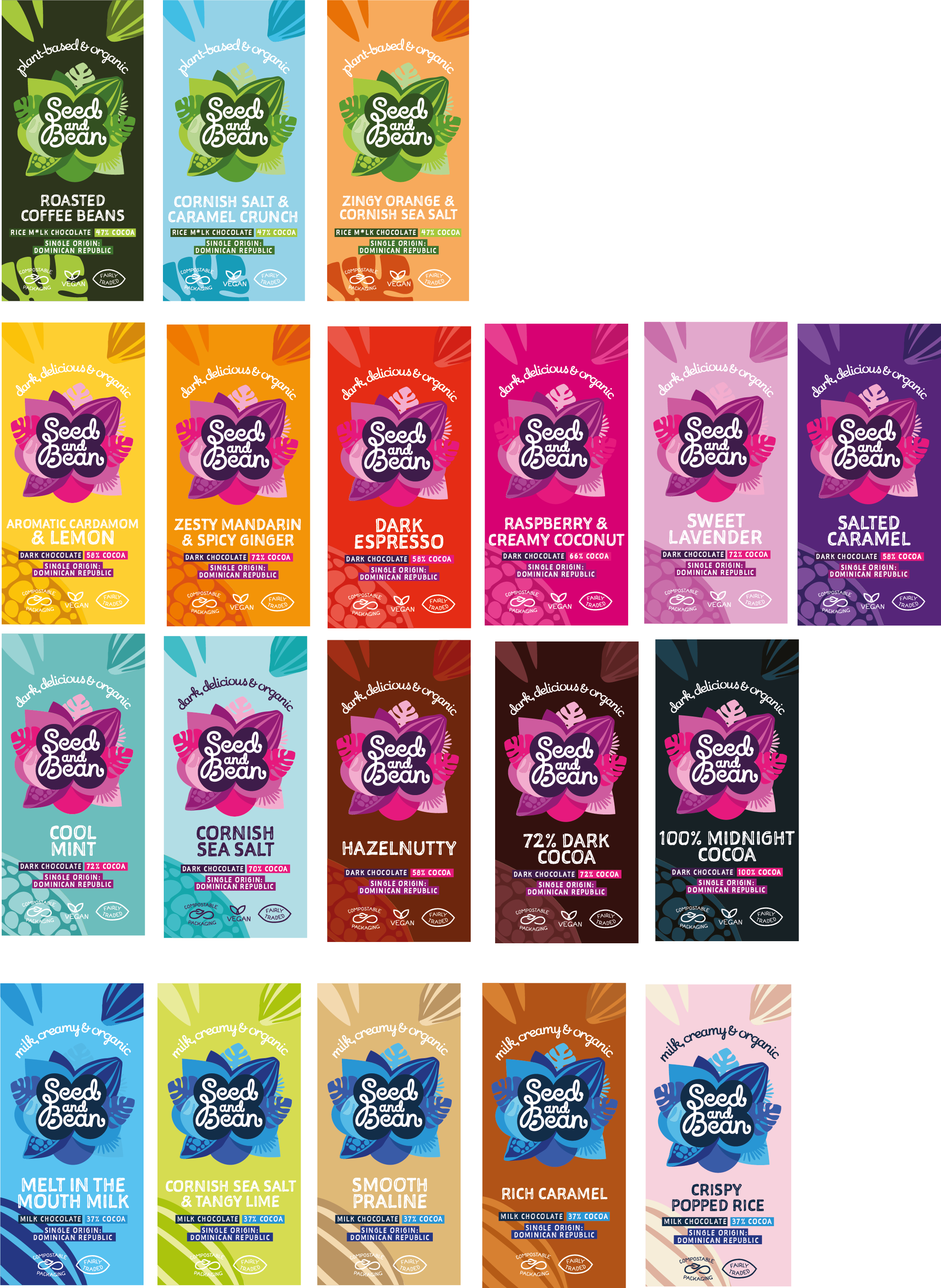
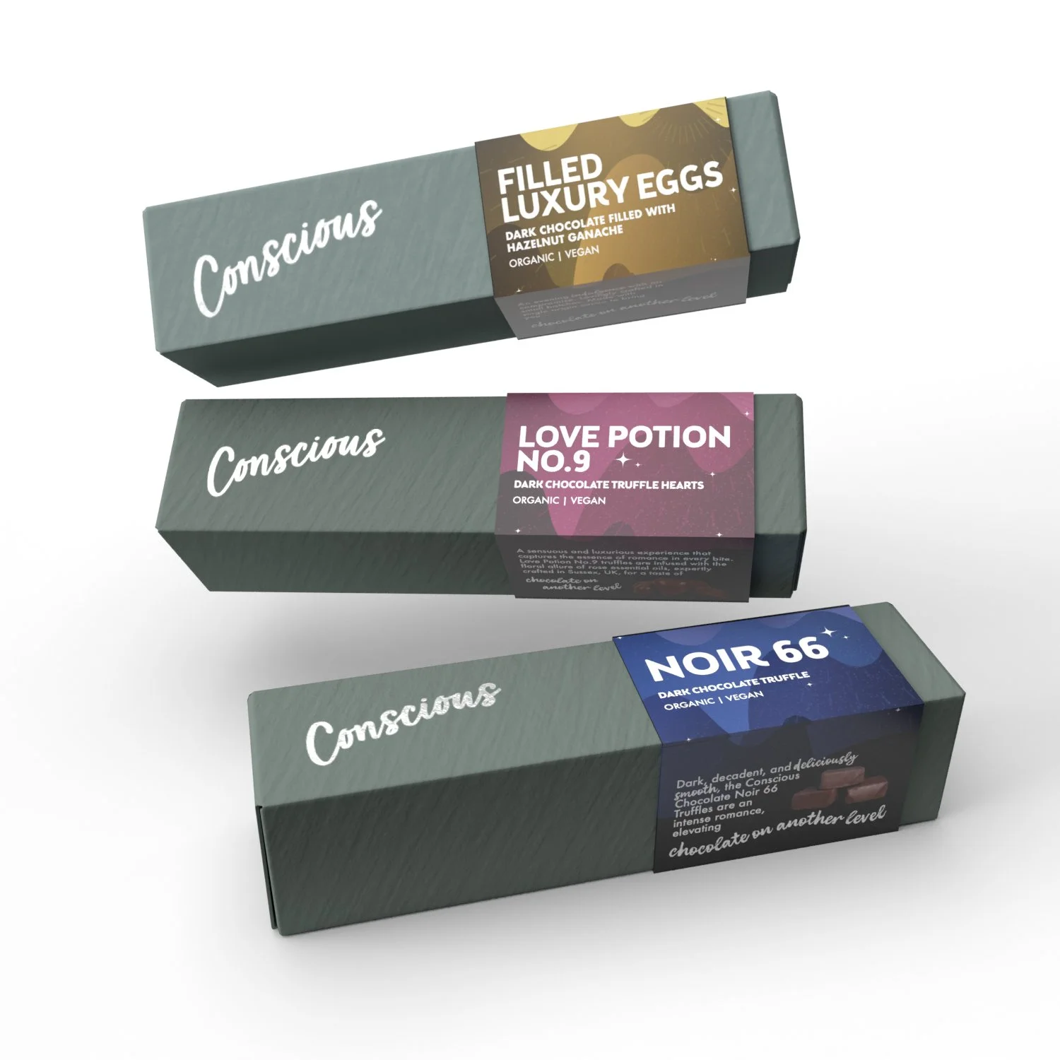
Client case study
After
To create a more unified approach, we split the bars up into ranges: Vegan, Dark and Milk. Each had their own colour rosette dedicated to the range. From there we assigned a rainbow of colours to the various flavours. We also added in pull out boxes on the front for key information and unified the USP’s on the front in an illustrative icon style.


Whether you're launching a new product, revamping your brand,
or just need some help with a one-off project, I'm here to help.